Overview
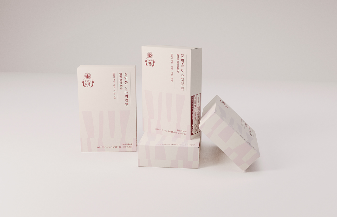
삼흥의 홍삼/도라지 정과, 절편은 꿀을 조려 만든 동양 전통 약재 음식 중 하나로 원형 그대로가 '정과' 자른 형태를 '절편'이라고 칭합니다. 여기에서 이 정과와 절편의 차이점을 그대로 보여주는 것이 이 패키지의 아이덴티티라고 생각했으며 여기에서 동양적인 그래픽을 따와서 독특한 패키지 그래픽을 완성시켰습니다.
Samheung's Red Ginseng/Ballflower Confectionery and Sections are one of the traditional oriental medicinal foods made by boiling honey, and the shape of the cut is called Sections. I thought it was the identity of this package that showed the difference between this confection and Sections as it is, and I took an oriental graphic from here and completed a unique package graphic.

Graphics
Layout :
동양의학에서 사람의 몸을 음기와 양기로 나눳습니다. 이러한 점을 착한 양기에 좋은 홍삼을 위쪽으로 음기에 좋은 도라지를 아래쪽으로 배치하는 식으로 레이아웃을 만들었습니다.
Oriental medicine divides the human body into yin and yang. The layout was made by placing red ginseng, which is good for good yang, upward, and bellflower, which is good for yin, downward.
Typography :
동양의 고서적에서 나오는 선으로 동양적인 느낌을 만들어 냈으며 중국어권 수출을 위한 한자와 음식의 효능을 같이 배치해서 약재라는 느낌을 선사했습니다.
It created an oriental feeling with lines from ancient books in the East, and provided a feeling of medicinal ingredients by arranging the efficacy of Chinese characters and food for export in the Chinese-speaking world.
Iconography :
절편과 정과의 차이를 보여주는 그래픽으로 홍삼과 도라지의 기본 형태와 자른 형태를 패턴의 주요 부분으로 만들어서 색다른 그래픽으로 만들었습니다.
It is a graphic that shows the difference between slice and tablet, and the basic and cut shapes of red ginseng and bellflower were made as the main parts of the pattern to make it a different graphic.


Color Palette :
큰 대비가 없는 색조합으로 몸에 부드럽게 스며드는 홍삼/도라지의 기운을 몸에 무리 없이 전달하는 인상을 줍니다.
With a color combination without much contrast, it gives the impression of conveying the energy of red ginseng/bellflower that permeates the body smoothly.
Typeface :
제목용 서체는 세련되고 부드러운 인상인 부크크 명조 Bold와 현대적인 한문 고딕인 Mplus 1p Regular을 조합했고 본문용 서체는 부크크 명조와 비슷한 본문용 서체인 본명조(Medium / Bold)를 활용해서 강개상인의 고급스러운면서 신뢰감있는 이미지를 전달합니다.
The title typeface combines the sophisticated and soft impression of the Bukkeu Mingjo Bold with the modern Chinese Gothic Mplus 1p Regular, and the text typeface uses the medium / Bold, a typeface similar to the Bukkeu Mingjo, to deliver a luxurious and reliable image of Kang Gaesang.